General User Interface
This article explains the basics of the OPNsense Graphical User Interface or GUI for short.
User Login
Before we can take a look at the GUI options we need to login. The default user is root and the password is opnsense.
GUI Layout & Main Components
The GUI consists out of the following main components:
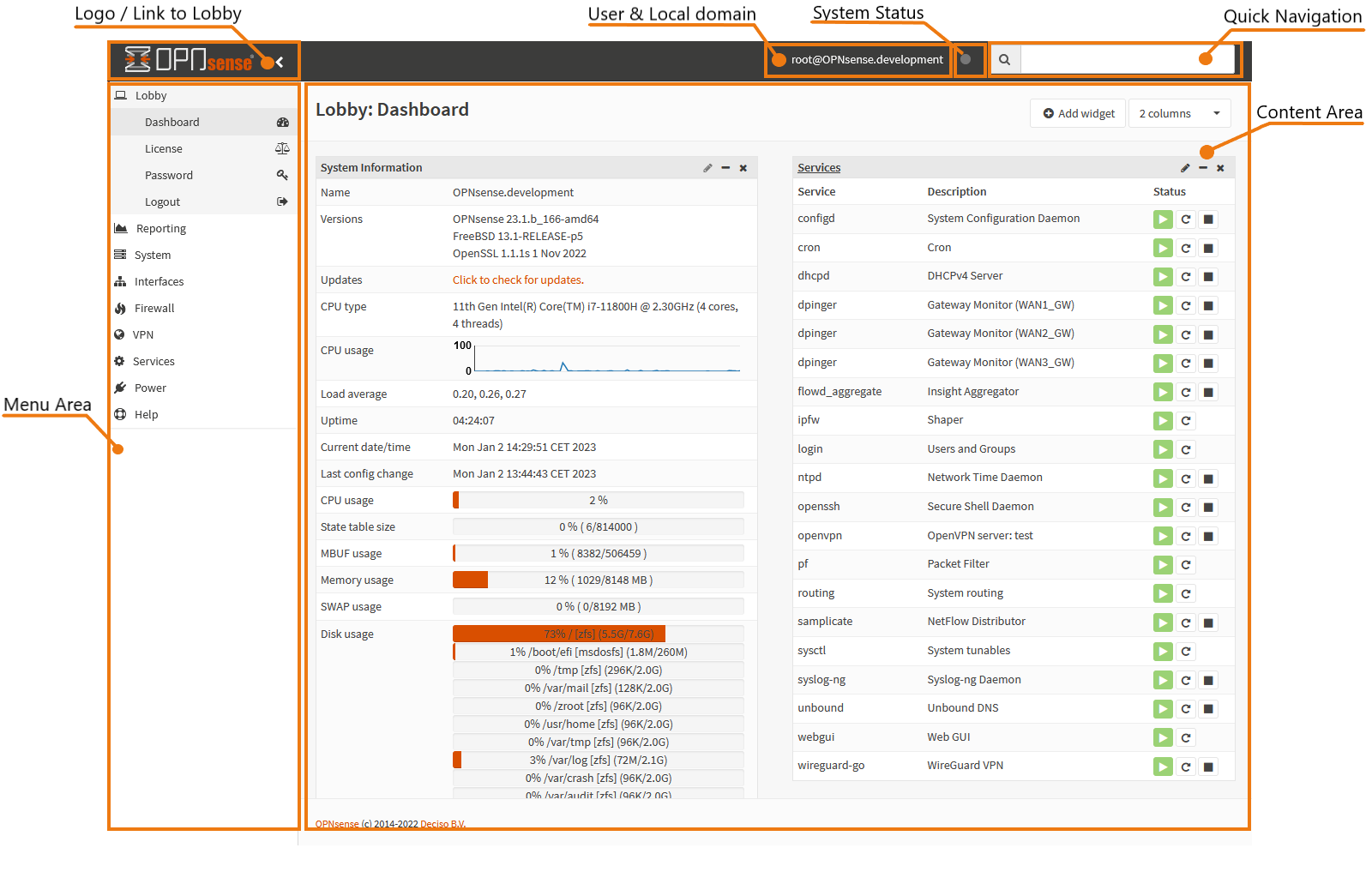
Logo & Link to Lobby
Click on the OPNsense logo wherever you are in the interface and you will be directed to the lobby and dashboard.
In the Lobby you can:
Look at the dashboard with widgets
View the 2-clause BSD license
Change your password
Logout
Menu Area
The Menu area holds all the primary menus and submenus. Here you can select what part of the system you want to watch or change.
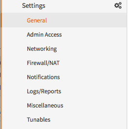
You can see the layering on the menu. There are three levels:
Category level
Function level
Configuration level (may not exist if the function is simple)
In the following sample you see a screenshot of the Category System, with:
Function: Settings
Selected Configuration item: General
Quick Navigation
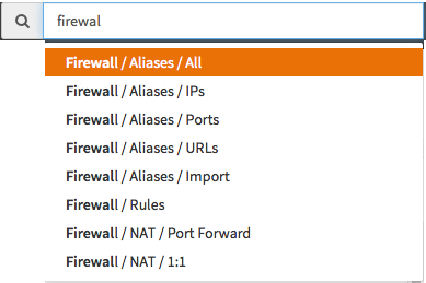
A faster way to navigate through the GUI is by using the quick navigation/search box on the upper right corner of the screen. Either click on it or hit tab to select it.
The search field is a type-ahead field, meaning that it will guess what you are looking for and fill up while typing. Hit Enter or click on an option to select and navigate directly to the right page.
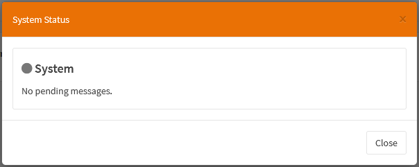
System Status
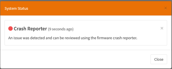
In the upper right corner of the screen is also a small indication of the system status. In a normal situation this will be greyed out, but it will display a color if something is wrong. You can click on it to review any of the pending messages, if any:
The colors indicate the severity of the issue. They are:
Red. Indicates that an error has occurred during system operation. Click it to go to the relevant page. In most cases this will be the crash reporter, which you can use to send us information about the crash.
Yellow. Indicates a warning.
Blue. Indicates an informational message.
Grey. Everything is working as normal.
User & Local domain
In the right corner just to the left of the system status you will see your username and the full domain name the firewall is configured with (to change firewall name, go to ).
Content Area
The content area is used to display:
Input forms
Popup Forms
Buttons
General forms of data output graphical and text based
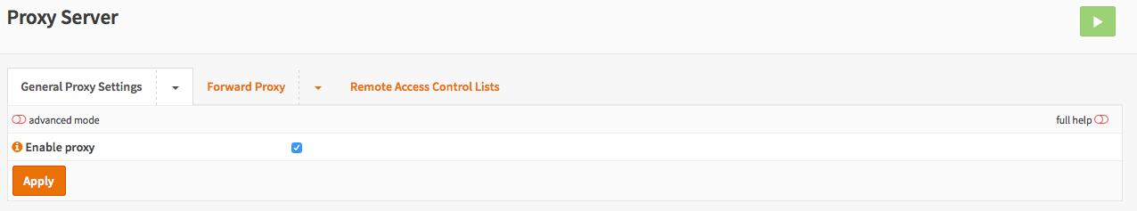
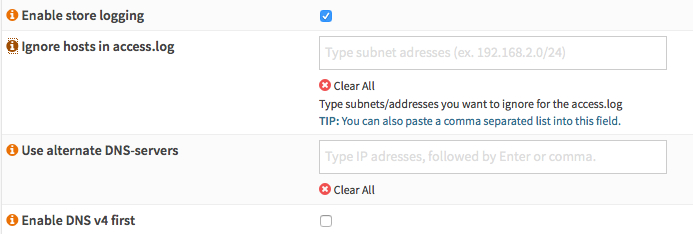
Form View
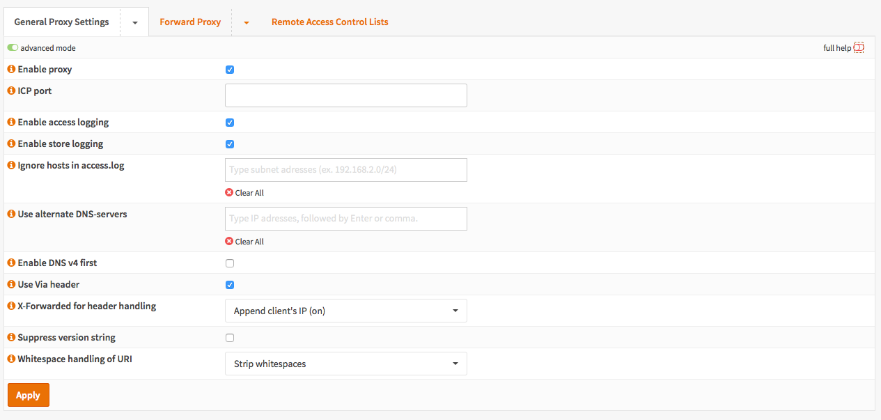
Let’s take a look at how an advanced form may look like:
Full Help
Many forms are equipped with built-in help. In the upper right corner of the form you can select to view all help messages at once. The toggle will color green when enabled and show the help messages beneath the input items.

Advanced Mode
Some forms have hidden advanced features, to view them toggle the advanced mode in the left corner of the form. Doing so will reveal all advanced options.
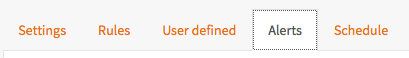
Standard Tabs
A standard tab can be clicked upon to open the corresponding form.
A sample can be seen here:
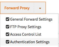
Dropdown Tabs
A dropdown tab can be clicked upon to open the first menu item or you can click on the arrow next to it to show all options, like so:
Data grids
Many components within OPNsense use grid views to navigate through content, below is an example of a simple table view supporting the most relevant actions.
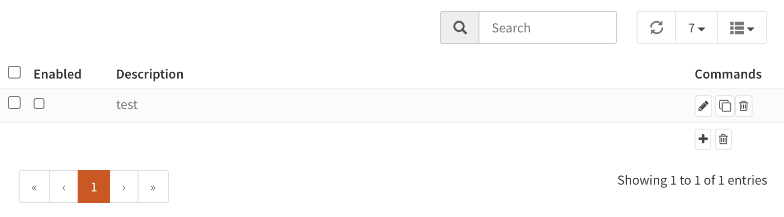
Fields
The available fields vary between components, the icon can be used to select which fields should be visible or hidden.Filter and limit
The top area of the grid contains a search input combined with a reload button and a selection for the number of rows to show at once on a page. Often the search input will be instantly applied, but in some cases a reload is needed if the action can't be processed fast enough.When using the filter in log files, you will find a Go to page action behind every record. This will jump to the corresponding page and show you all surrounding records so you can see the context of a log message.
The search input tokenizes space-delimited words, causing the filter to return records matching all of the clauses included in the search phrase.
Actions
Different actions could be supported on a (set of) records:- / Enable / disable a record
- Edit a record
- Copy a record and edit
- Delete a record, usually this will ask for a confirmation
- Add a new record and open edit dialog